Having delivered a range of creative executions and comms ideas for the promotion of Equity For Punks V fundraising in 2018, BrewDog approached us once again in 2019. This time, they asked us to pitch a new brand identity for the next round of EFP funding. It would need to be recognisably BrewDog while also being able to stand alone as a concept for nationwide rollout.
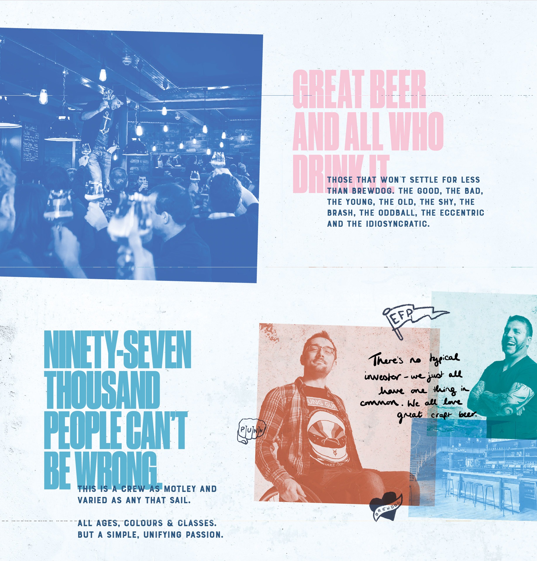
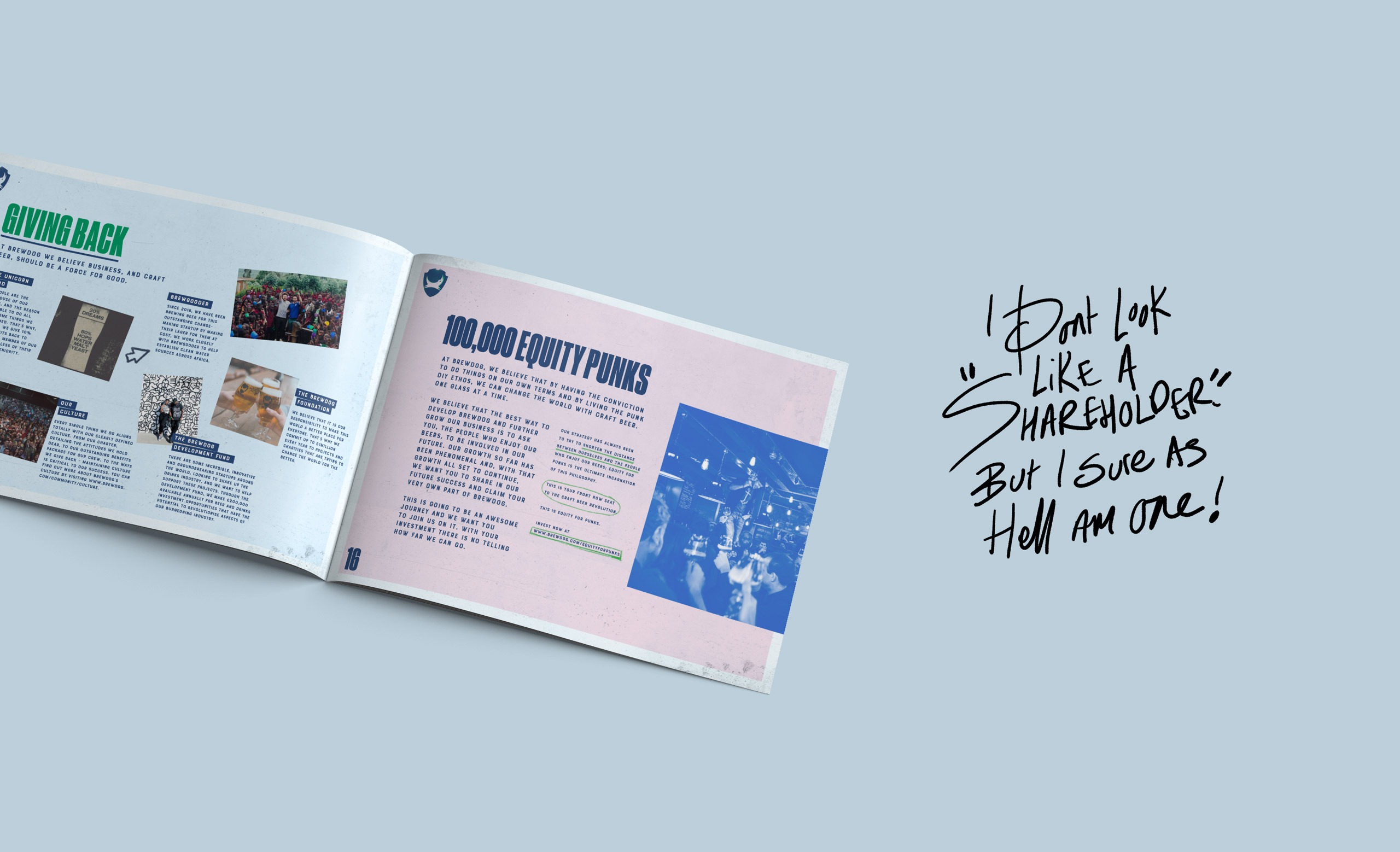
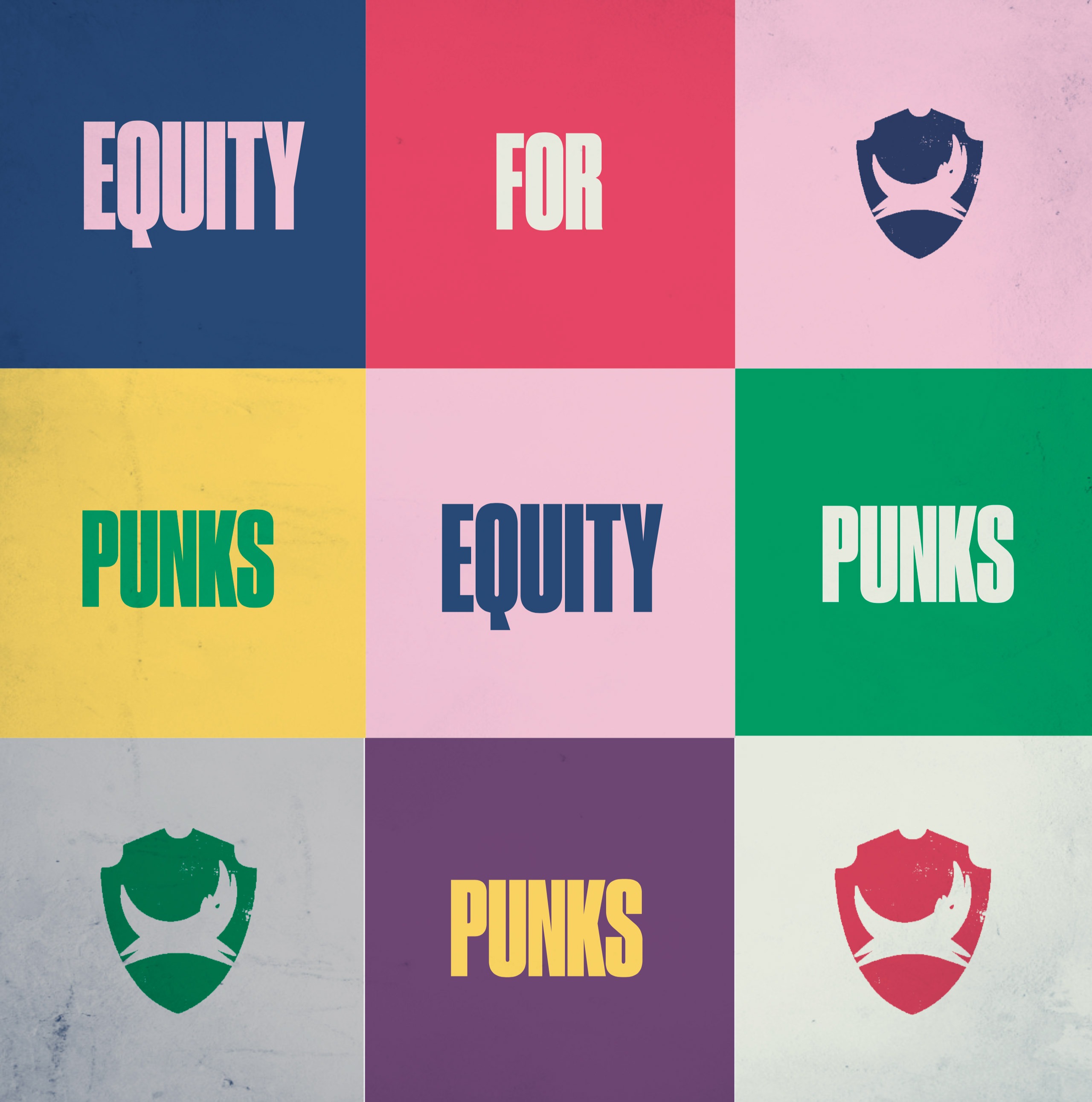
Using the idea of the pre-existing Equity Punk community as the bedrock of our creative concept (both in terms of promoting repeat investment while also attracting new Punks), we created a bold typographic led-approach, complete with a bespoke ident and bolstered by a vivid pastel palette. Our copy retained that well-established BrewDog tone of voice, while delivering messages that were a deliberate appeal to inclusiveness and community.
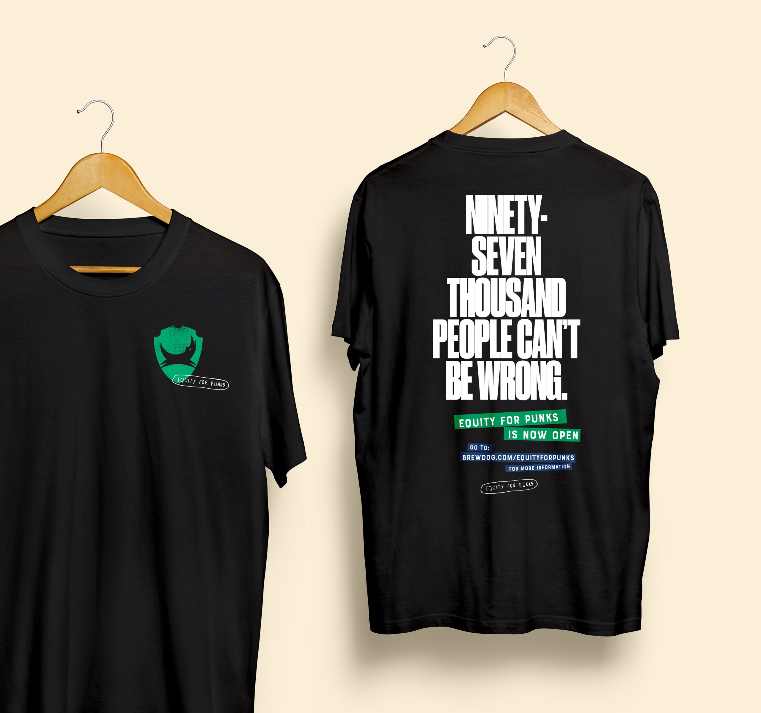
Having won the pitch process, we went on to further develop a range of collateral from staff merch, to window vinyls, wall murals and voucher wallets. The creative concept has since been rolled out across UK bars nationwide and is being translated for use across Europe, including France, Germany, Italy and Spain.