Branding & Creative

Where The Wit Pours Dark.

Wit Huis

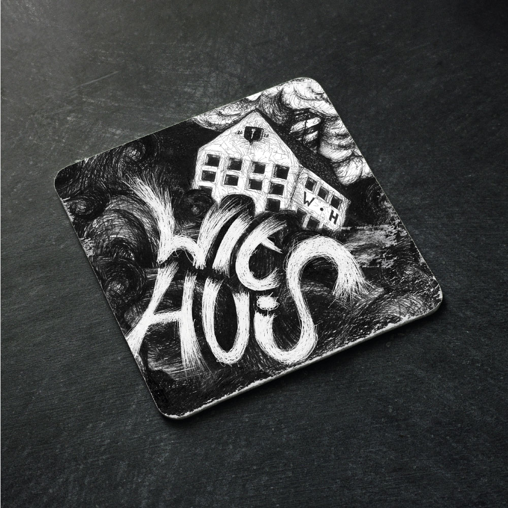
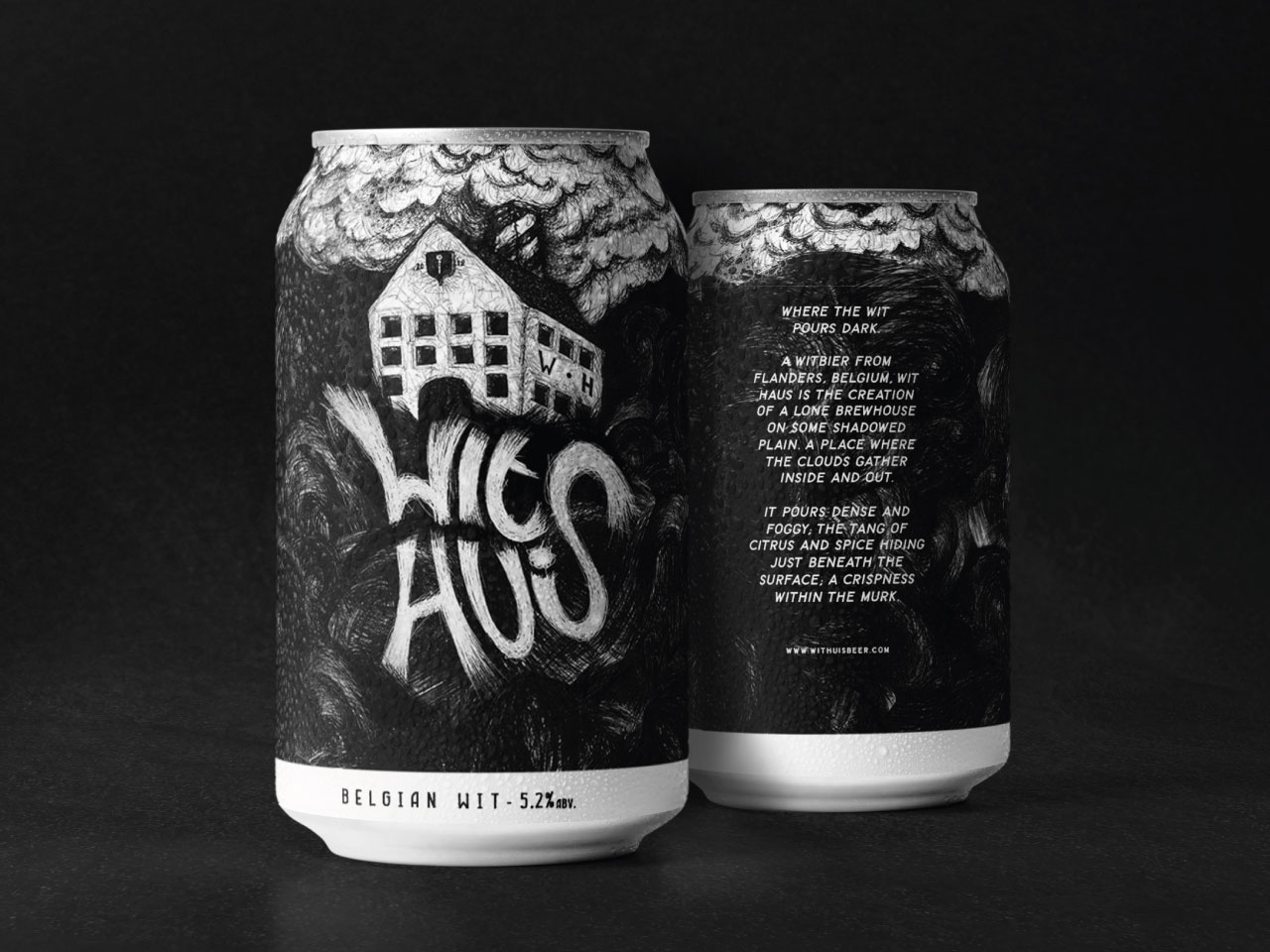
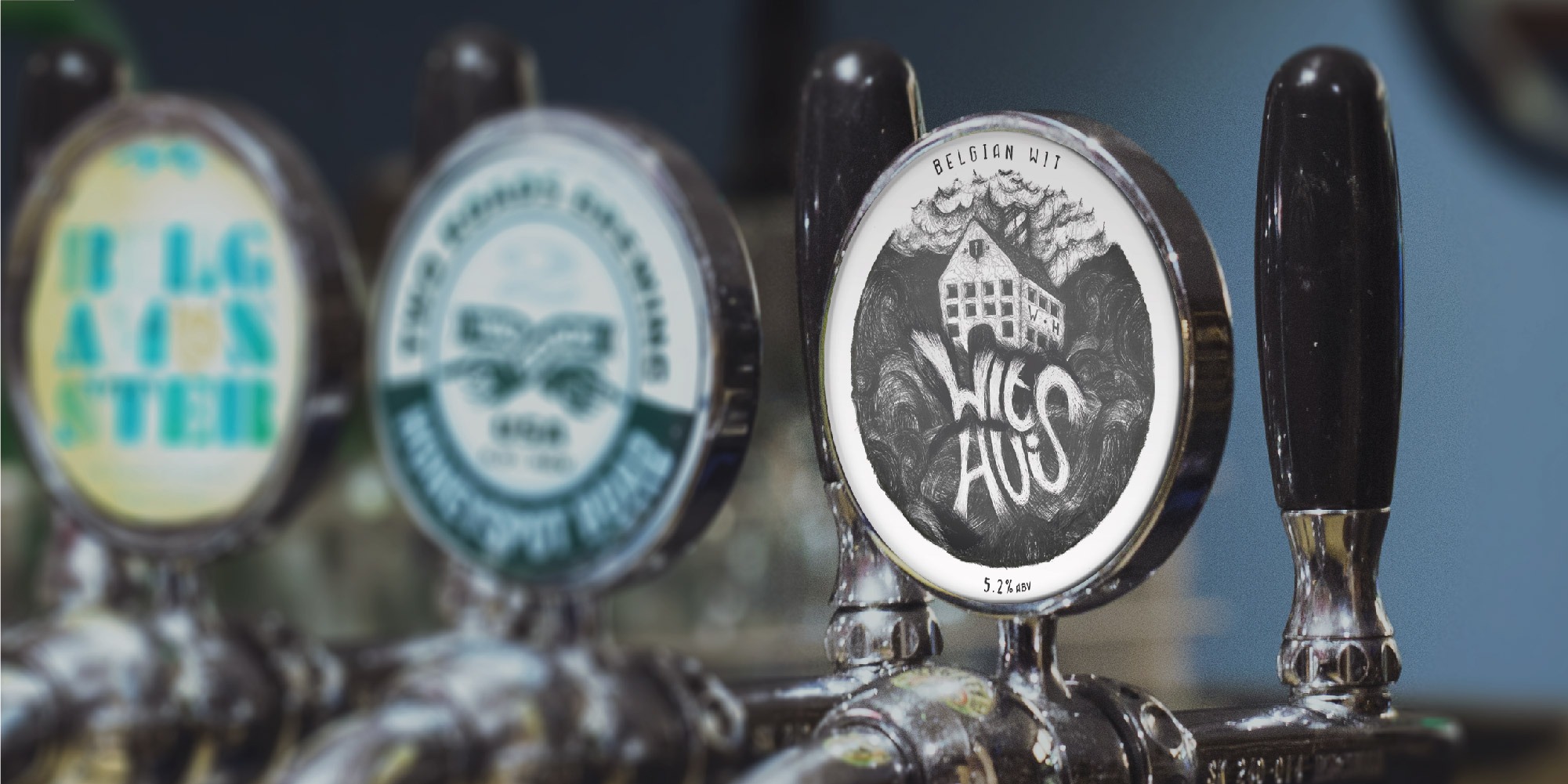
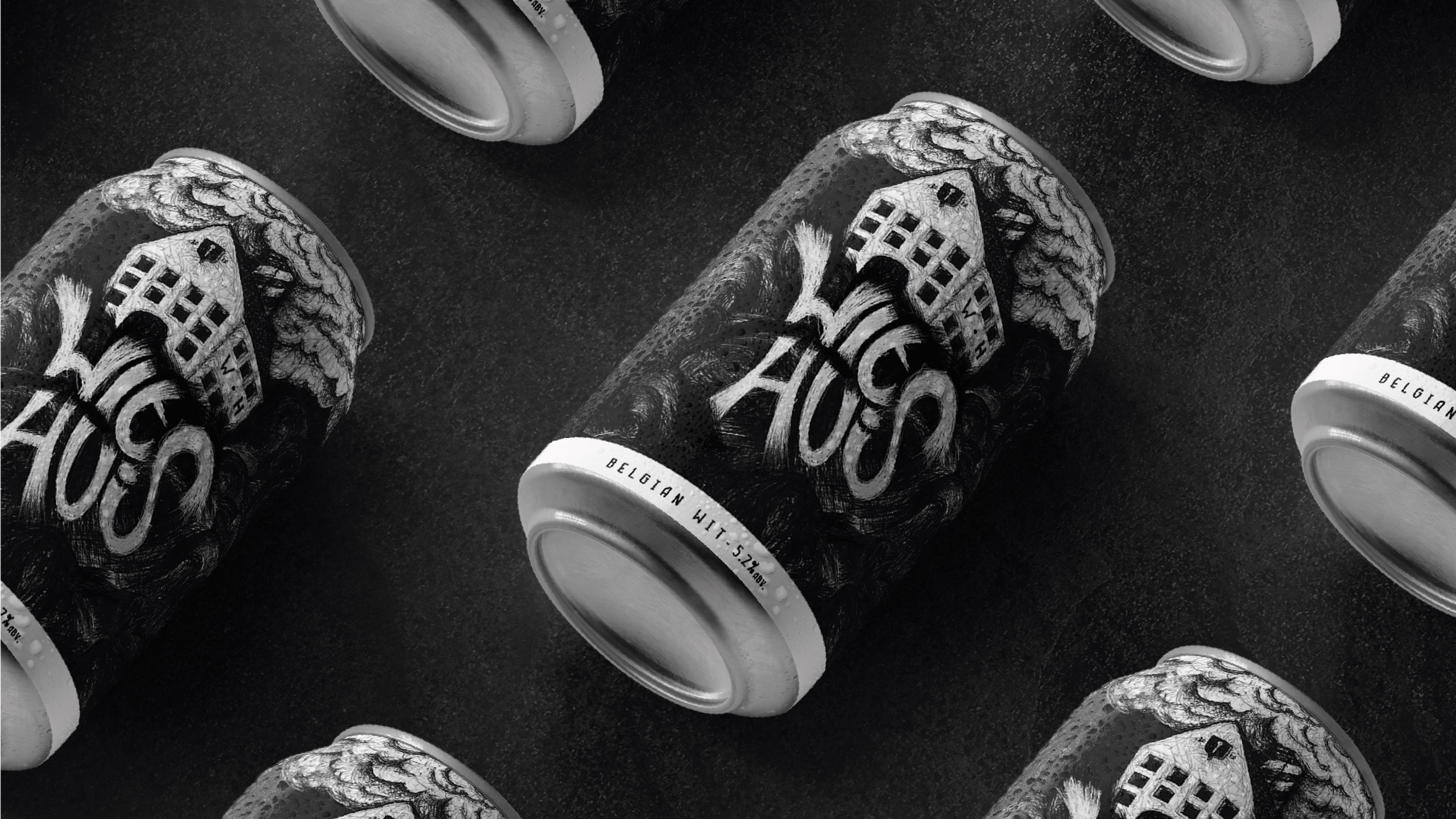
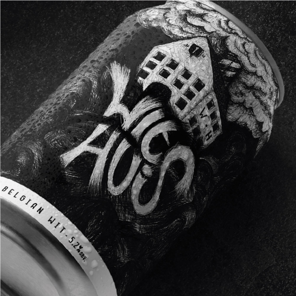
Client and beer distributor, James Clay & Sons, came to us with a proposition. An unusual one.

It had acquired access to craft witbier from a brewery based in the Flanders region of Belgium. The beer had previously been sold as the house beer of a local pub, but remained largely unknown outside of that particular locality.

James Clay felt it had potential as an import. It saw an opportunity, and asked us if we wanted in by a) leading on creating a new brand and b) taking a commercial stake. We decided we did. The opportunity to brand our own beer was too good to pass up.

We knew the beer was a Flemish witbier. But the rest was a mystery. We were in the dark. So we built our brand around just that: mystery and darkness. We called it ‘Wit Huis’ as a reference to what little we knew about its origins, and as a distant play on its more illustrious English translation.

But our Wit Huis was to be the capital of nowhere, and our dark witbier a satisfying contradiction. The design set about telling that story; a scratchy, monochrome hand-drawn illustration style that gave a sinister and eerie feel to the brand. A ghostly, slightly desolate-looking brewery caught between doomy stormclouds above and a swirling, witchy wordmark below. And all looking awesome on can and tap badge.

Wit Huis has not launched yet, but watch this space. Especially if you like your witbier poured dark.