Branding & Creative, Strategy

A brief history of.

Grumpy Mule

ilk and Grumpy… well, we go back a bit.


In fact, we go back so far that we weren’t even called ilk when we first started working together. Spoooooky.


Anyway, picture the scene: it was 2014. It was second-term Obama. Pitbull was making diabolical music with Kesha. And third and fourth-wave coffee was but a twinkle in hipster’s eyes. 


At some point amidst all of that, Grumpy Mule came to us with a challenge. And then one thing led to another.
The Rebrand.


Our first job together was the biggie. 


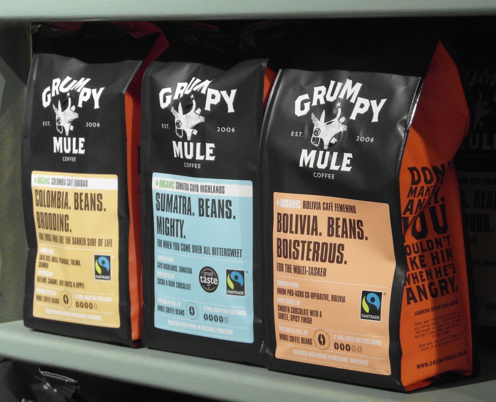
A full rebrand, with a core brief to create a brand that could deliver on the promise of the name.


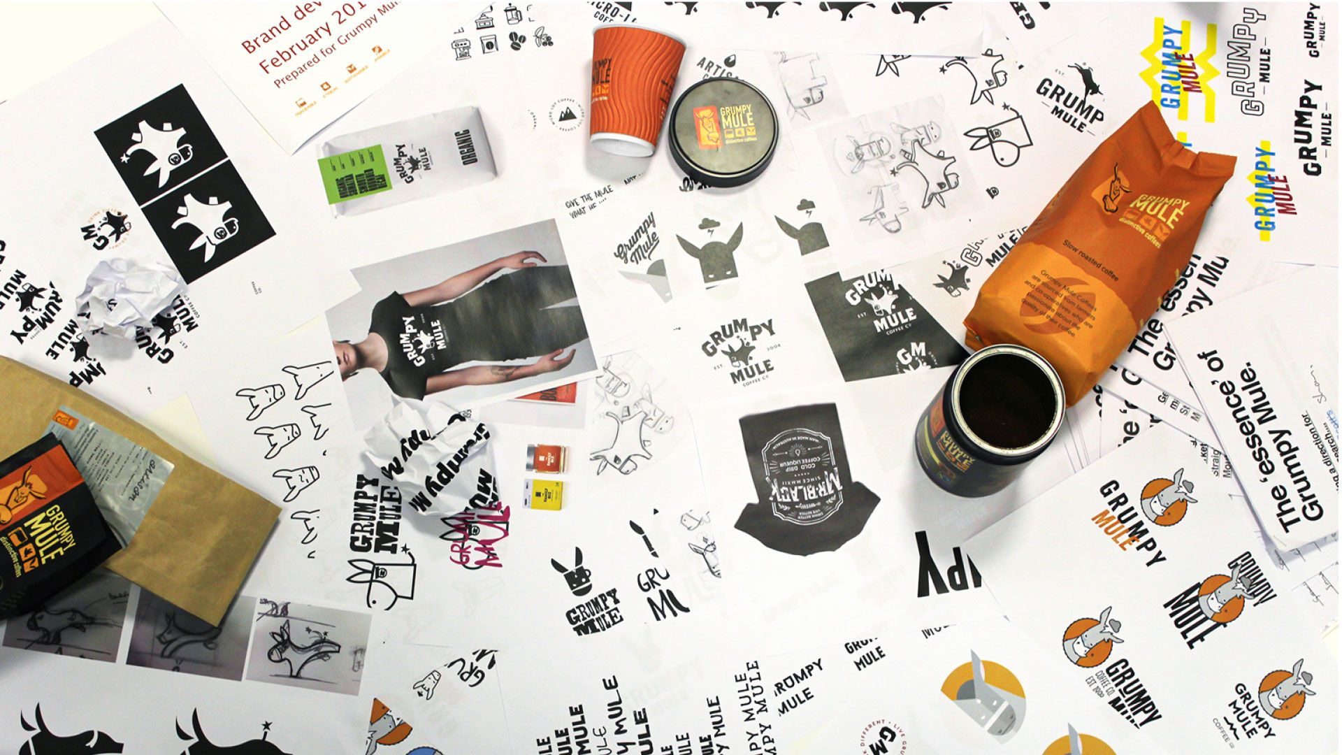
Cue an 18-month project in which we went from consumer research, to brand routes, to packaging concepts and an e-commerce website design and build.


The chosen route ended up as a literal expression of the name. A character-based logo, designed to perfectly complement a distinctive, signature tone of voice – sarcastic, sassy and occasionally caustic in calling out sub-standard coffee.


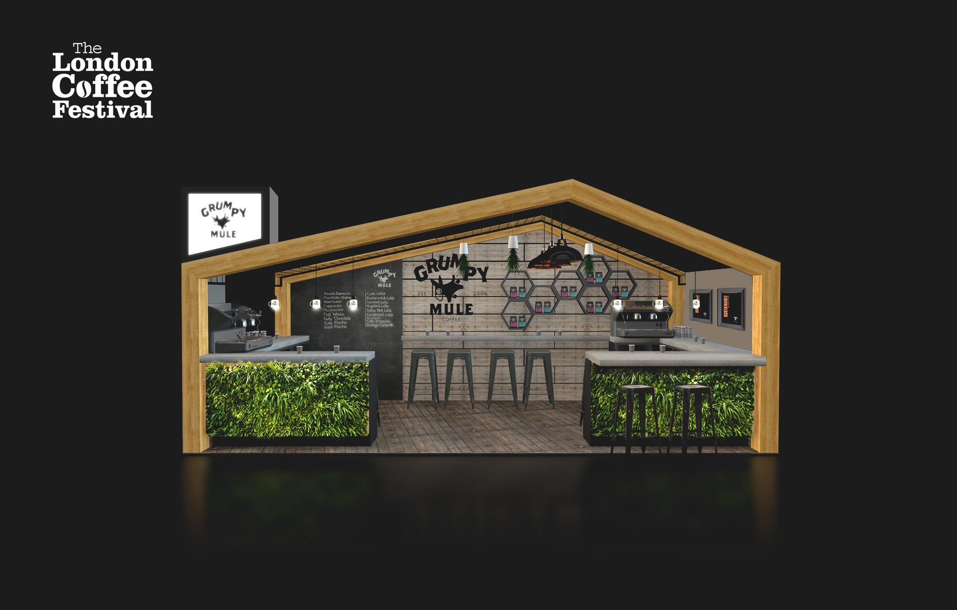
The direction was bold and meant the brand could launch in a blaze of glory at The London Coffee Festival 2015 (we designed and branded the event stand), before finding its way into national retail and food service. 


Post-launch, Grumpy were able to measure a sales uptick of over 30%.

The Evolution:
Grumpy Mule 2.0


Post-launch, we continued to work with Grumpy as its go-to creative agency, but our next big project was not until a few years later.


Almost immediately upon completion of the rebrand, we began planning for the future. We knew that with a brand identity as direct and brash as Grumpy, there would be a time whereby the brand would need to evolve in order to a) stay relevant in a fast-moving market and b) ensure our style of messaging didn’t outstay its welcome with the customer base.

That time came in 2018 when Grumpy asked us to envision what might come next. By this time the coffee market had moved on significantly, with standards of product and brand having dramatically improved. In response to that, we shifted our approach a little. We softened our tone a little: still sassy, still willing to say some things, but with less of a focus on ‘bad’ coffee in the sector, and more just looking to engage and entertain.


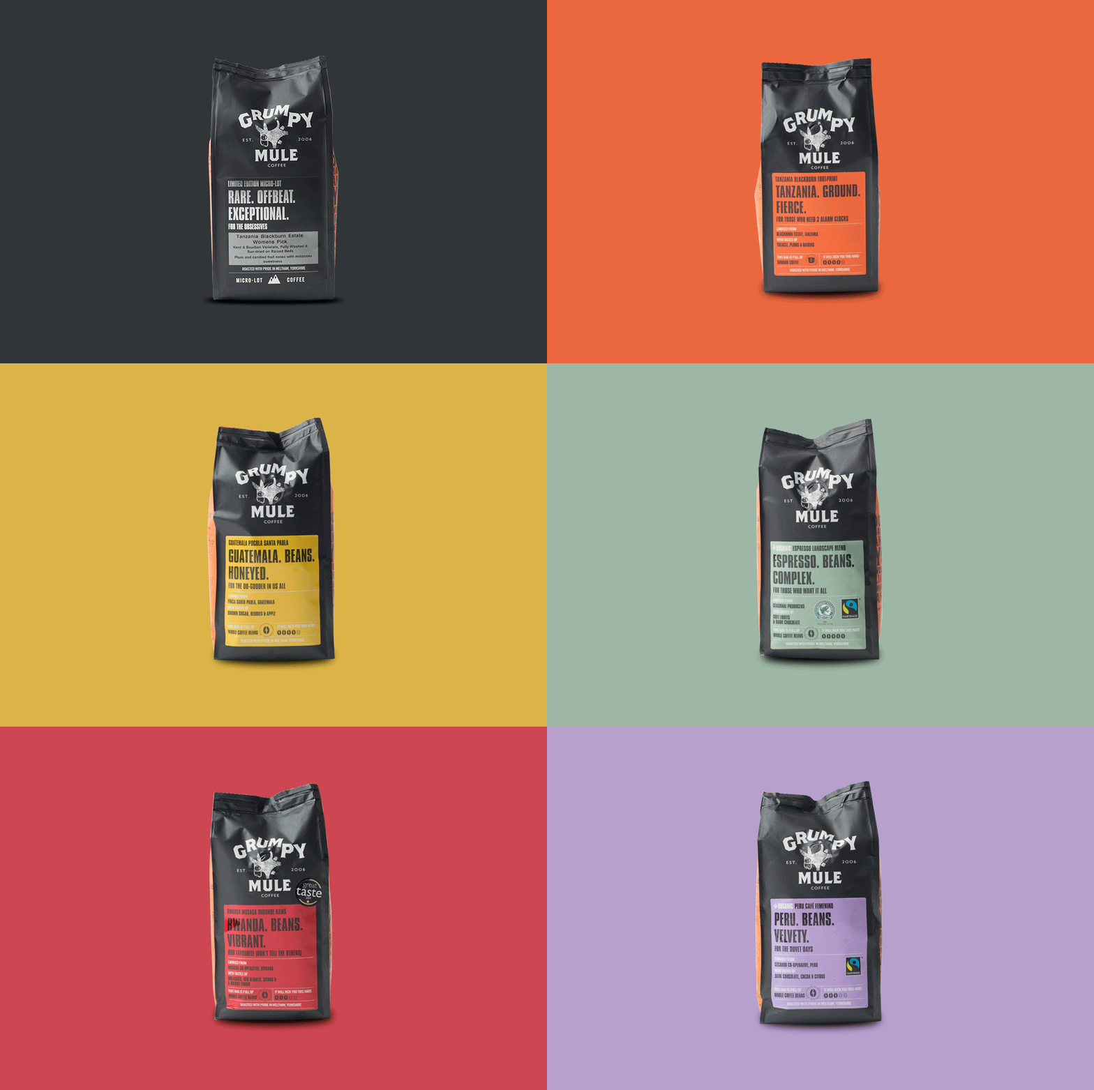
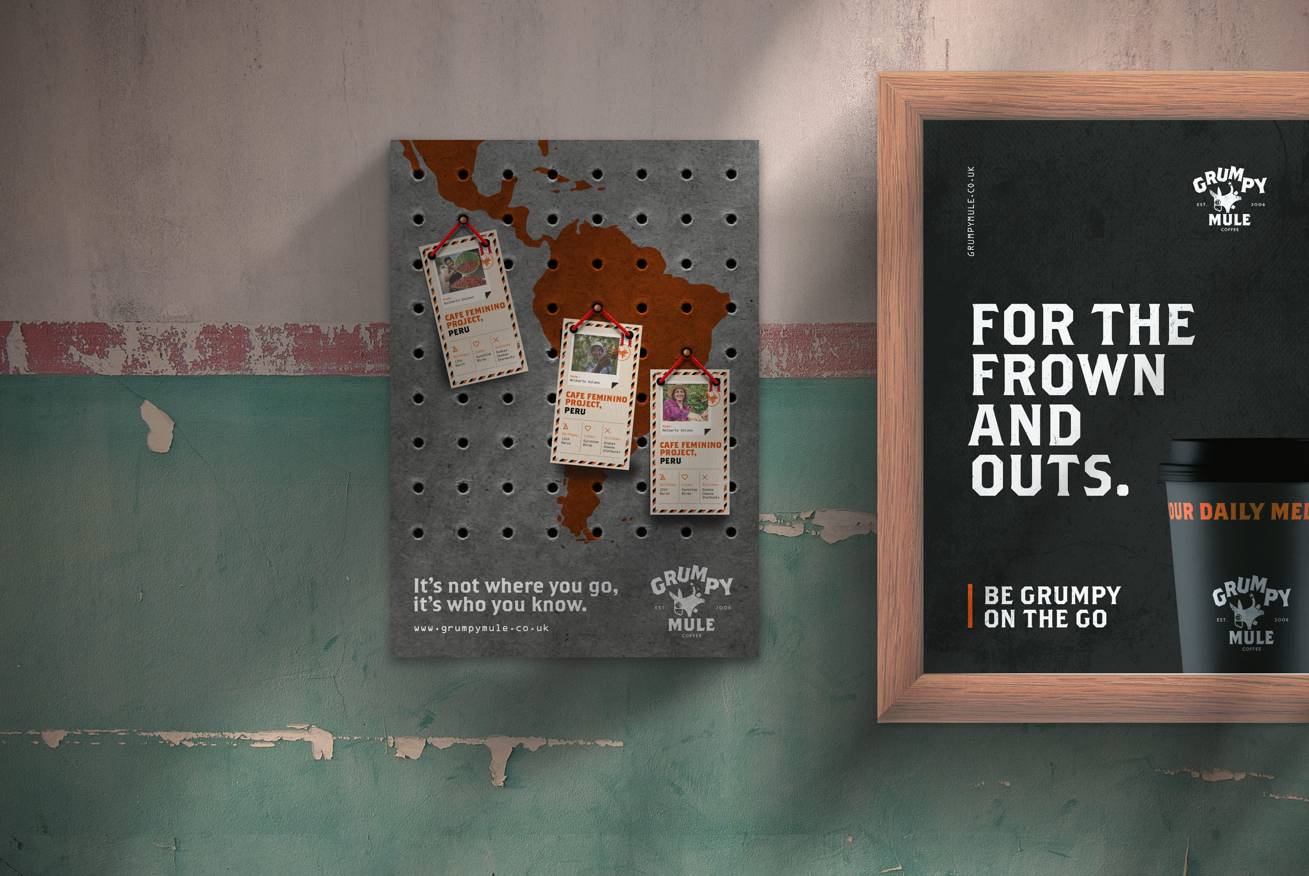
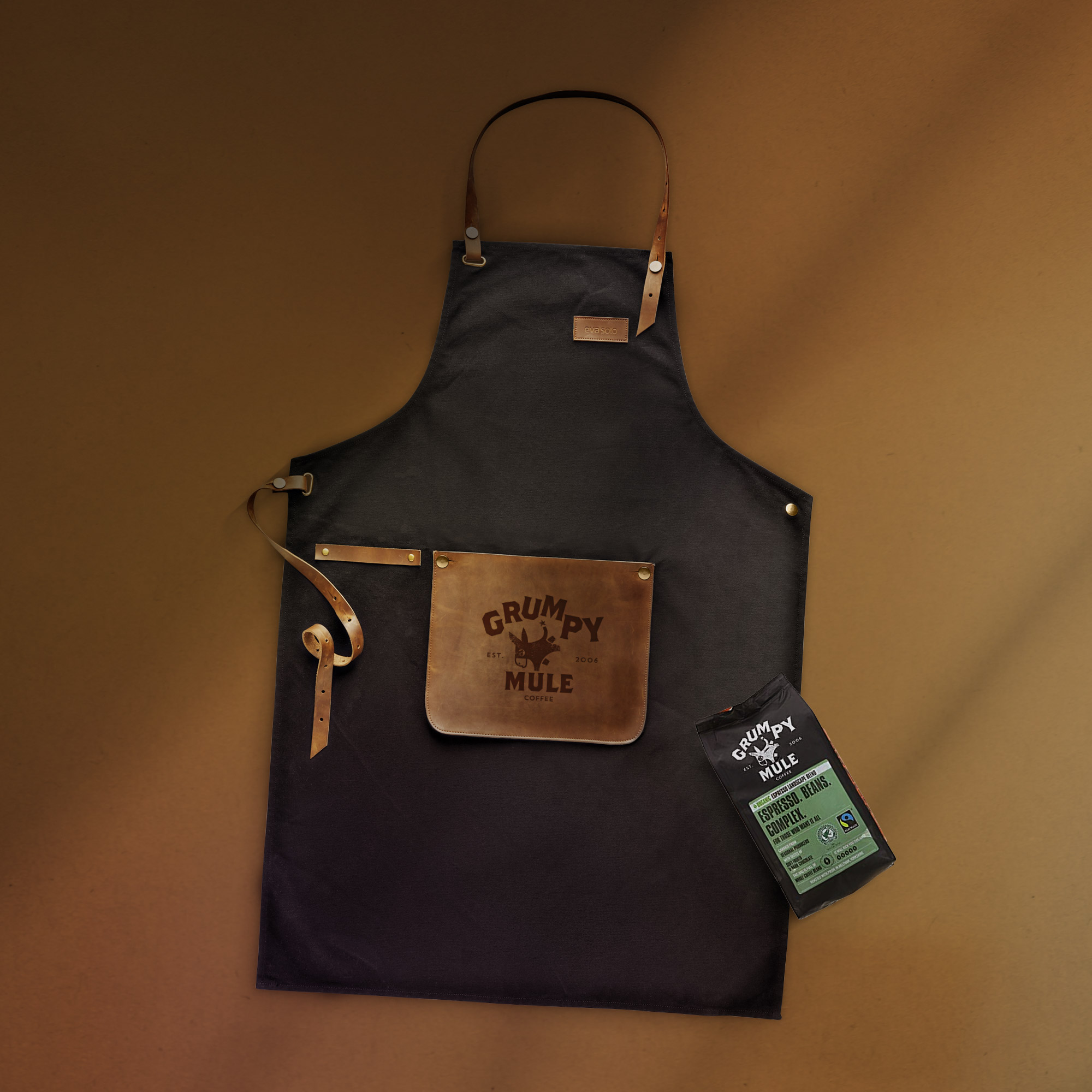
Likewise, from a design perspective, we stripped it back. The signature orange became an accent colour rather than a dominant one, contrasted against a deeper background palette of black and grey. We then applied this across a full range of collateral (including takeaway cups, napkins, menu boards, posters etc) and into Grumpy’s Mule food service network of over 200 sites countrywide.

A brief history of.
A brief history of.