Why the 2024 Word of the Year couldn’t be anything but ‘brat’.
No one who works in marketing will forget the ‘brat summer’ of 2024, when everyone from disruptive brands to politicians battling for re-election were sprinting to turn things lime green and swap their carefully chosen logo typography for Ariel Narrow. So, with ‘brat’ recently declared the Collins Dictionary’s Word of the Year, we asked Social and Paid Exec (and self-confessed Angel), Elliot Joyce, to take a deep dive into what really made brat magic.
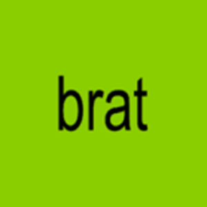
As a die-hard Angel, I wasn’t exactly confused when Charli XCX unveiled the artwork for her sixth studio album, brat, at the start of the 2024. Already knowing Charli’s creative collaborators, as well as being obsessed with the potential imagery around her signature clubbing and dance sound, it’s safe to say I was ready to eat up whatever visuals she had lined up…and indeed I did!

The lime green square was almost offensive to my phone’s calming night mode, and as a strong believer in title case for track listings, I can’t help but think that brat was an attempt to break down my psyche! I wasn’t alone in thinking this, as Twitter was flooded with the usual ‘experts’ with no expertise, fans with no creative background offering art direction tips, and others just downright piling on the front cover. I was scared! This is just like one of those revolutions in which the people turn on their beloved queen, and I wasn’t ready to have my Angel status questioned over a colour. I’m being dramatic, of course, and it wasn’t until I read an article interviewing Charli about the upcoming release in which everything made sense.
In a cover story for Vogue Singapore, Charli questioned why fans feel ownership over female artists, so much so that they demand for them to be seen and photographed, labelling it ‘misogynistic and boring’. After all, with the rise of criticism, fan edits and comparisons between seemingly only female artists and their front covers, it’s understandable that Charli wanted to exclude herself from the firing line, even from a personal perspective. To be seen, is to be judged.
The choice for a text cover was also determined by frugality. As she knew brat’s sound would not appeal to everyone, and therefore not perform as well commercially, she believed that an expensive photoshoot was off the cards. This was apparently met with confusion from her team, who condemned it as ‘the stupidest idea ever’, and pushed her to reconsider. However, with a few mockups, colour samples, and a play around with some potential fonts, Charli was able to (Talk) talk her team into seeing the brat side of life.
Explaining the now-iconic colour choice, Charli stated that green is such a saturated colour in the world – in nature, in logos, and even in fashion; it wasn’t too long ago that Bottega green was dominating the trend cycles, and everything we know about semiotics will tell us that green equals good. The decision to subvert this universally loved colour and turn it into something almost repulsive aligns well with everything that brat represents. From her candid lyrics and controversial song themes, brat is nothing short of confrontational.
Channelling this sentiment into a colour – and a really polarising one at that – is way more effective at visualising the album’s message than a (no-doubt) stunning photo of the hyper-pop princess herself.
It’s also a great way to connect her image to other tangible things in the world. Think of Beyoncé’s Renaissance – any time I see silver, chrome or other metals, all I think about is her gracefully shining on a glitterball horse. And this can be seen across other artists too – Taylor Swift with the colour red, Olivia Rodrigio with the colour purple and even Nicki Minaj with her consistent love for the colour pink. Creating a brand, a sound, and attaching a feeling to a distinct colour is something that helps a project become omnipresent. In the days after the artwork was announced, parked cars, buses, handrails, dustbins, Bic lighters and even matcha lattes all suddenly became brat due to their slight resemblance to the shade. Something that was initially supposed to be abrasive ended up becoming everyone’s next obsession.
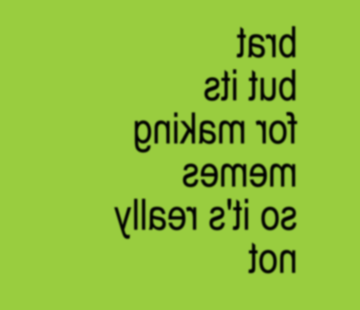
Suddenly, people, businesses and politicians were becoming part of the brat universe with the help of an interactive brat-generator – a customisable meme in which you create your text in the style of the brat front cover.

Something so shareable, and not even trying to take itself too seriously, suddenly became the biggest marketing force behind the project. Of course when your album is littered with club classics, and it’s kickstarting its own viral TikTok dances, you’re able to let the music speak for itself. But in this case, brat is enough of a powerhouse alone without you even needing to press play.
I think that all boils down the simplicity. From a design perspective, it isn’t trying too hard, and it’s not interested in aligning itself with what we know is currently trendy. Not only is brat just an insanely good record, it is also a reminder to trust your gut and to stay true to your vision. As someone who’s been developing their creative practice for many years, I think it’s really powerful that you can feel so inspired and driven by what essentially is just…a really ugly album cover.
Brat and it’s completely different but also still brat will be teaching us how to make the most of minimal marketing for many years to come, I feel.